Modern Keycloak Themes: Keycloakify with TailwindCSS and shadcn/ui

Introduction
In our previous blog posts, we extended Docusaurus with API documentation, integrated Tailwind CSS and shadcn/ui, and secured internal docs with Keycloak and OAuth2 Proxy.
One piece is still missing: the login experience itself. While Keycloak is a powerful and flexible identity provider, its default theme looks inconsistent with most modern applications. When users log in to a web portal, the experience should feel polished and aligned with the rest of the platform.
This is where Keycloakify comes in. With Keycloakify you can build Keycloak themes using React, TypeScript, and the modern frontend ecosystem. Combined with TailwindCSS and shadcn/ui, you can design a login flow that feels at home with the rest of your stack.
In this article, we’ll walk through setting up a Keycloakify project, integrating TailwindCSS and shadcn/ui, and deploying a custom theme to Keycloak.
What is Keycloakify?
Keycloakify is an open-source toolkit that lets you create Keycloak themes with modern frontend frameworks. Instead of relying on FreeMarker templates or directly editing static HTML, you can use React, Angular, or Svelte to build your theme just like any other frontend application.
One of its biggest advantages is the ability to test and preview the components in Storybook. When you’re done,
Keycloakify compiles your project into a .jar file that Keycloak can load as a provider.
Keycloakify offers:
- A component-based theming workflow (JSX/TSX), so you can reuse UI parts easily.
- Use of TailwindCSS for utility-first styling, making it easier to maintain consistent spacing, colors, typography.
- Optional integration with shadcn/ui (or any component library you choose) so you can have polished UI primitives (buttons, cards, inputs) out of the box.
Building a Custom Theme
Keycloakify Starter
Start with the official keycloakify-starter project. It comes pre-configured for React and gives you all the basics you need to start developing a theme.
Check out the repository and install the dependencies:
git clone https://github.com/keycloakify/keycloakify-starter
cd keycloakify-starter
rm yarn.lock
npm install
In this tutorial, we use npm as the package manager. You can also use yarn or pnpm if you prefer. Check out the
official Keycloakify documentation for details.
Storybook
Storybook lets you preview and test your pages outside of Keycloak in isolation. By default, the starter project does not contain any stories. Use the Keycloakify CLI to generate stories for pages such as login, register, terms, and error.
Select the page login.ftl and run storybook:
npx keycloakify add-story
npm run storybook
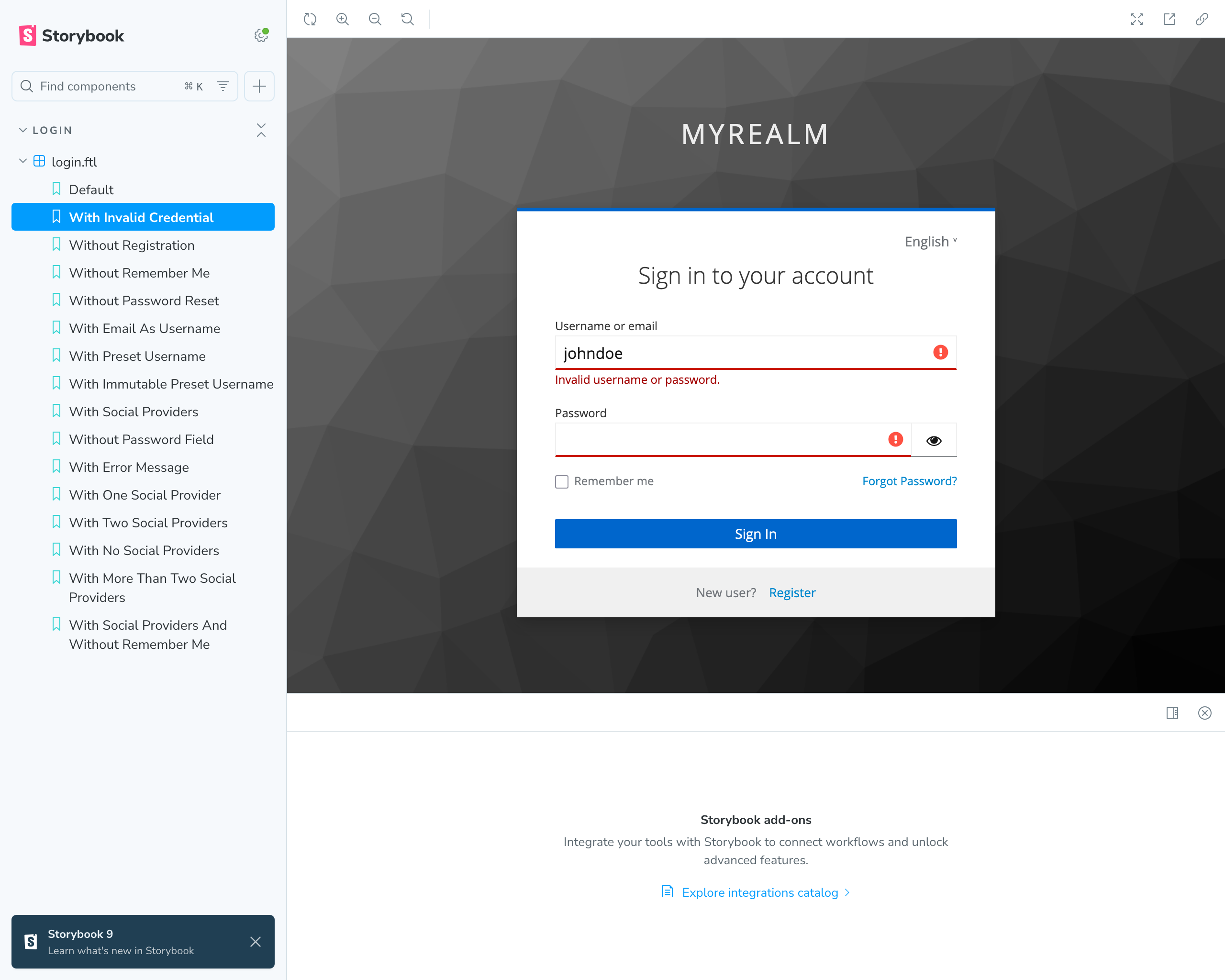
This opens Storybook in your browser on http://localhost:6006. You can see the default login page rendered with placeholder data. You can interact with the form and see how it behaves.
TailwindCSS
Let's install Tailwind CSS and the Vite plugin for Tailwind:
npm install tailwindcss @tailwindcss/vite
More information about how to install Tailwind CSS can be found in the official documentation.
Add the @tailwindcss/vite plugin to the Vite configuration:
import tailwindcss from '@tailwindcss/vite'
import { defineConfig } from "vite";

export default defineConfig({
    plugins: [
        tailwindcss(),
    ]
});
Now, let's create a CSS file for the login theme src/login/index.css and add the Tailwind directives:
@import 'tailwindcss';
@layer theme, base, components, utilities;
@import 'tailwindcss/theme.css' layer(theme) important;
@import 'tailwindcss/preflight.css' layer(base) important;
@import 'tailwindcss/utilities.css' layer(utilities) important;
@import "tw-animate-css";
The @import 'tailwindcss' is important! Otherwise, the shadcn/ui CLI cannot validate the Tailwind installation.
Import the CSS file:
import './index.css';
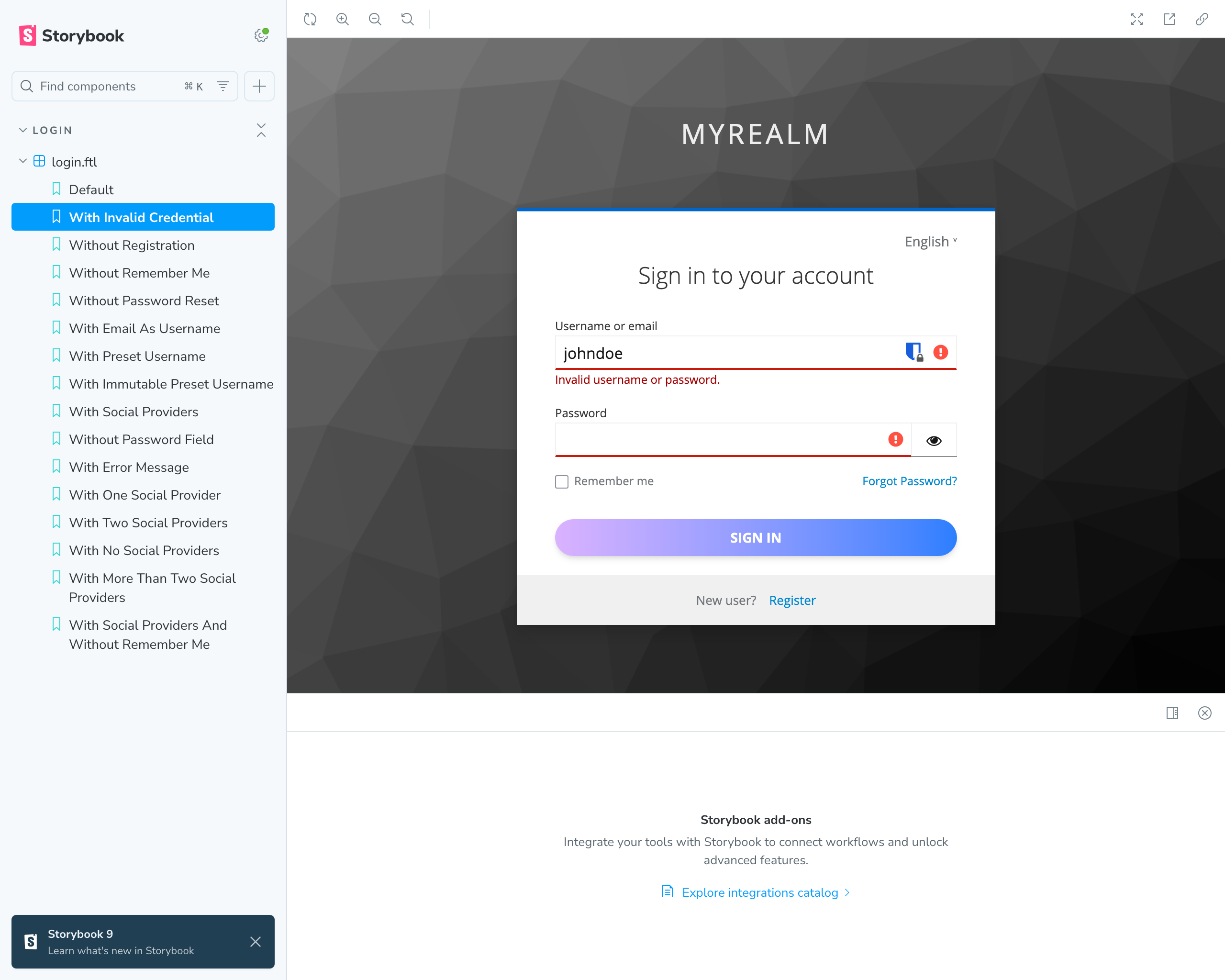
Now it's time to test Tailwind. Customize the kcButtonClass class and check in Storybook if it works:
.kcButtonClass {
    @apply px-5 py-2.5 text-green-900 font-bold uppercase bg-gradient-to-r from-purple-300 to-blue-500 border-none rounded-full shadow-md transition-transform duration-200 ease-in-out;
}
The login form should now look like this:
shadcn/ui
shadcn/ui gives you a library of well-designed components, already compatible with Tailwind. Install it and add components such as buttons, inputs, and forms to your Keycloak pages. To use the shadcn/ui CLI some additional steps are required.
npm install -D @types/node
Add the following code to the vite.config.ts so your app can resolve paths without error:
import path from "path"
import tailwindcss from '@tailwindcss/vite'
import react from "@vitejs/plugin-react";
import { defineConfig } from "vite";
import { keycloakify } from "keycloakify/vite-plugin";

export default defineConfig({
    plugins: [
        react(),
        tailwindcss(),
        keycloakify({
            accountThemeImplementation: "none"
        })
    ],
    resolve: {
        alias: {
            "@": path.resolve(__dirname, "./src"),
        },
    },
});
Also add an import alias to tsconfig.json file:
{
    "compilerOptions": {
        // ...
        "baseUrl": ".",
        "paths": {
            "@/*": ["./src/*"]
        }
    }
}
Run the shadcn init command to setup your project and add a button component:
npx shadcn@latest init
npx shadcn@latest add button
More details about how to install and configure shadcn/ui for Vite can be found in the official documentation.
To use the shadcn/ui button component, eject the login.ftl page:
npx keycloakify eject-page
And update the page router:
// ...

const Login = lazy(() => import("./pages/Login"));

export default function KcPage(props: { kcContext: KcContext; }) {
    // ...
    return (
        <Suspense>
            {(() => {
                switch (kcContext.pageId) {
                   // ...
                   case "login.ftl": return (
                       <Login
                           {...{ kcContext, i18n, classes }}
                           Template={Template}
                           doUseDefaultCss={true}
                       />
                   );
                   default: return <Fallback /* .. */ />;
                }
            })()}
        </Suspense>
    );
}
Now you can use the shadcn/ui button in the Login.tsx page. First, import the button component:
import { Button } from "@/components/ui/button";

<form id="kc-form-login" ...>
    ...
    <div id="kc-form-buttons" className={kcClsx("kcFormGroupClass")}>
        <input type="hidden" id="id-hidden-input" name="credentialId" value={auth.selectedCredential} />
        <Button
            tabIndex={7}
            disabled={isLoginButtonDisabled}
            className={kcClsx("kcButtonClass", "kcButtonPrimaryClass", "kcButtonBlockClass", "kcButtonLargeClass")}
            name="login"
            id="kc-login">{msgStr("doLogIn")}</Button>
    </div>
</form>
Remove the styles for .kcButtonClass from index.css. The login form now looks like this:
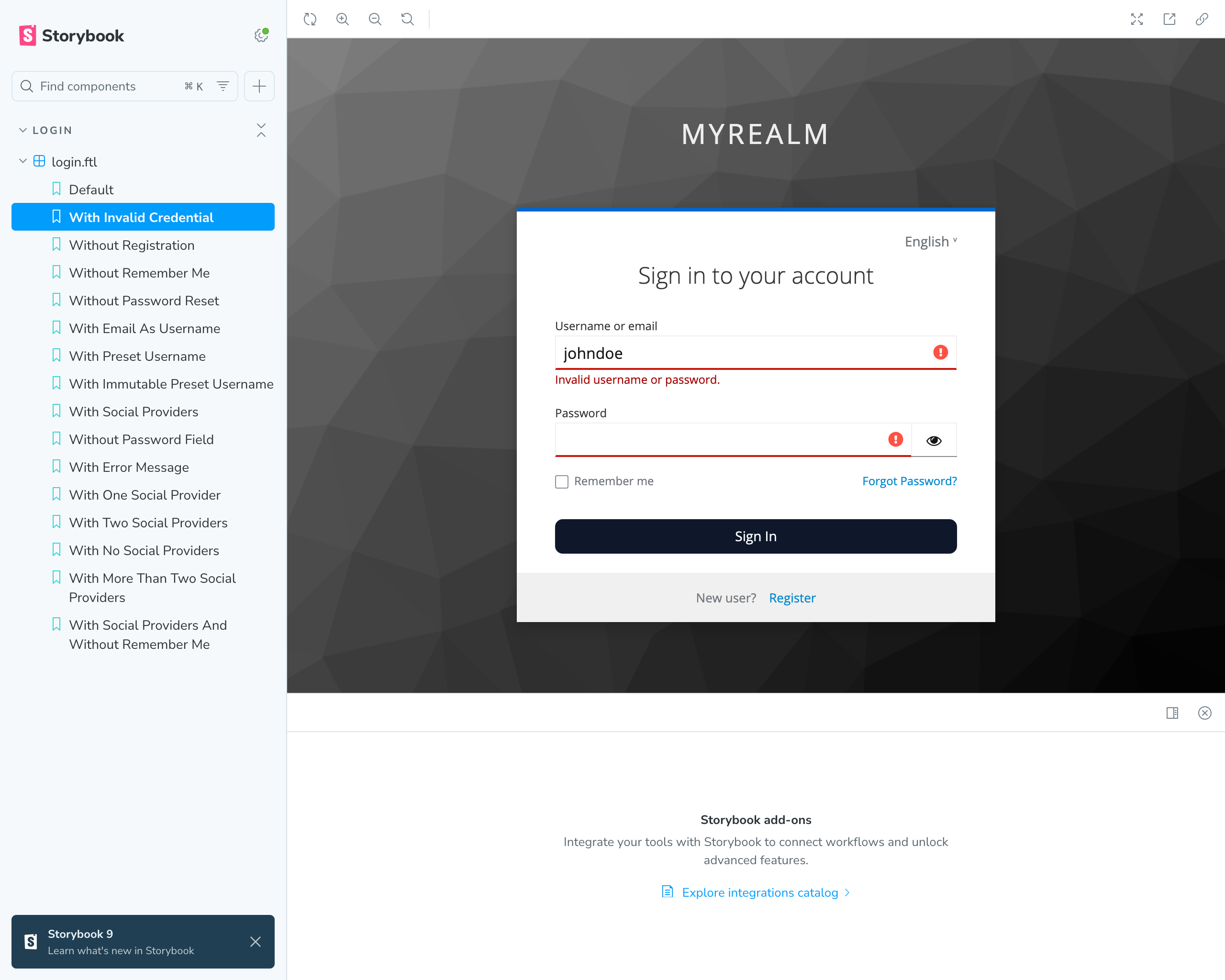
You can now use any shadcn/ui component in your Keycloak pages. For example, you could replace the input fields with the shadcn/ui input component. Check out the shadcn/ui documentation for all available components.
Build and Deployment
In Keycloak, custom themes are packaged as providers. Technically, a theme is built into a .jar file that you place in
the providers/ directory of your Keycloak installation. On startup, Keycloak scans this folder, loads all providers,
and makes the themes available in the Realm Settings → Themes dropdown of the admin console.
Keycloakify automates this process: when you run npm run build-keycloak-theme, it produces the .jar file for you. You
simply copy the file into your Keycloak container or installation and restart the server. After that, the theme behaves
just like any built-in option.
By default Keycloakify generates multiple .jar files for different versions of Keycloak. As we only need an artifact for
Keycloak Keycloak 26+ configure the keycloakVersionTargets in vite.config.ts like this:
keycloakify({
    keycloakVersionTargets: {
        "22-to-25": false,
        "all-other-versions": "docusaurus-theme.jar"
    }
})
Build the theme:
npm run build-keycloak-theme
The created .jar file can be found in the dist_keycloak directory.
More information about how to build and deploy your theme can be found in the official documentation.
Conclusion
Customizing Keycloak no longer means editing static templates or wrestling with FreeMarker. With Keycloakify, you can build themes in React (or Angular, or Svelte), test them quickly in Storybook, and package them into a deployable .jar file.
Using TailwindCSS and shadcn/ui ensures your login and registration pages look polished and consistent with the rest of your product. The result: a modern, maintainable theming workflow that integrates seamlessly into your existing frontend development practices.